
So….many of you were interested in how I produce photos with my lettering on it. I thought I would take the time to craft a blog post (my first official one!) giving you the inside scoop on my process. This technique is great for home decor, invitations, photo accents, or just to turn your lettering into a vector image for sharing online!
I had to learn a few things the hard way, but due to this post, you won’t have to!!! I will warn you up front that I do not use any Adobe products to produce or edit any of my photos yet. I have been thinking about getting one of those monthly subscriptions to make use of Adobe Illustrator, but right now, I just use free tools! These instructions are perfect for anyone on a budget or people who want to turn their creations into Vector art because ya know….free tools! Come on y’all free software….who isn’t excited about that!!!
Part 1: Get The Tools You Need
The programs that I use to create my work are GIMP and Inkscape, along with a few things I just recently added called Whitelines paper and the Whitelines Link app. Using the free tools along with the Whitelines sketch notebook I can take my handmade artwork from paper and transform into a digital format.
GIMP is a free photo editing software. I use this program to add my lettering work as a layer over the top of a photo image. I use Inkscape, which is a free software, to trace black and white images into a vector image that is clean and can be scaled easily.
Let’s get started!!
Part 2: Transform Hand Lettering To An Electronic File
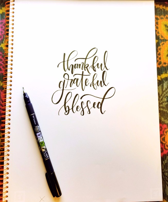
We will start with using the original piece written out on a Whitelines sketch notebook. This is my original handmade piece.
Then, you will want to open the Whitelines Link app to create a digital version of the original hand lettering. When you open the app it will show you all of your notes. You will see an orange camera at the bottom right. Go ahead and select the camera to get started with a new note.

Next place your phone over your artwork and make sure that the entire page is inside the screen. It takes a second to process and then you will see a display of your digital work. At this point you can send the digital file to an e-mail, or upload to Evernote and Dropbox accounts as seen at the bottom of the following image. For the best results make sure that you have good lighting over the image. Lighting helps with obtaining those super crisp lines when the app is rendering the digital copy of your original work.
.
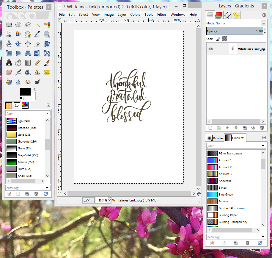
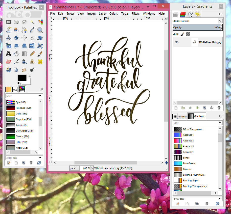
Tada! You’ve just produced a digital image using Whitelines Link as below:

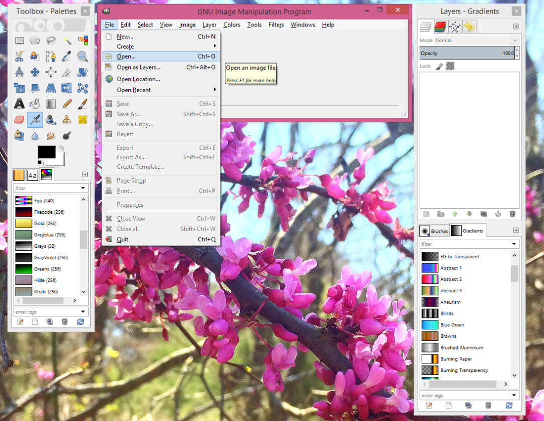
Good work! Now that you have your file electronically stored on your computer you will then want to open it using GIMP in order to transform it into a black and white photo.
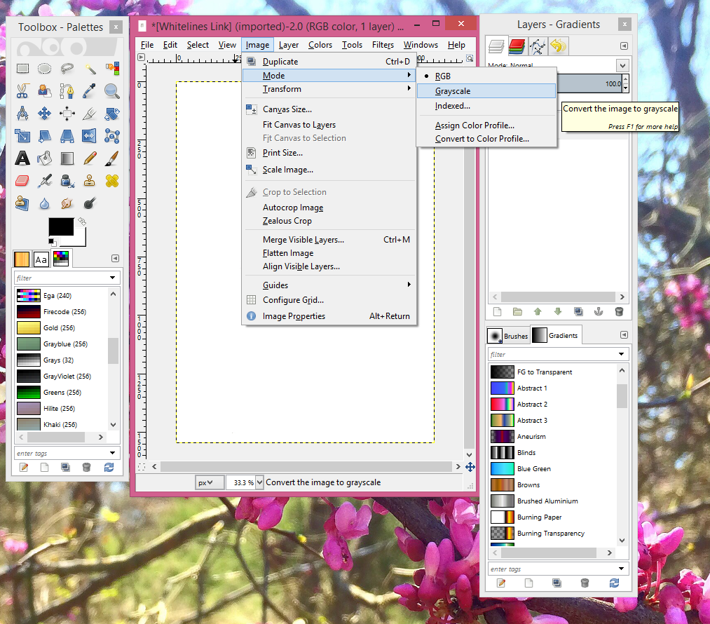
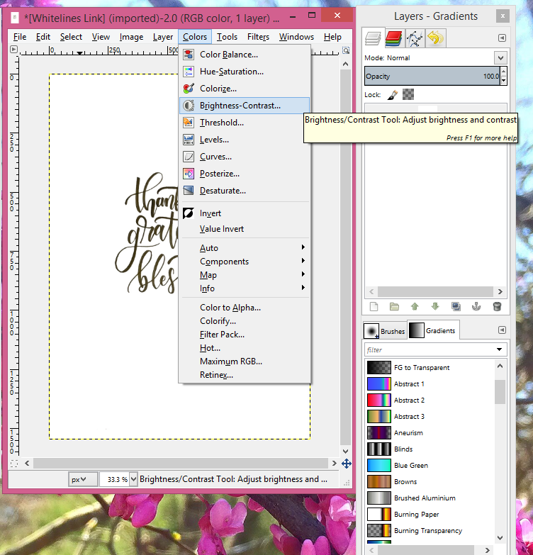
You will then want to change your image from a color to a grayscale file! Navigate to “Image and, from there, navigate to “Mode” then “Grayscale” as below:
“Image->Mode->Grayscale
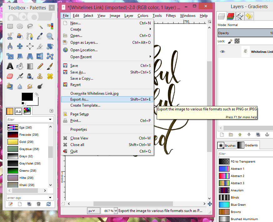
This will enable you to transform your photo into a black and white image! You will then want to increase the contrast and reduce the brightness until you have a black and white photo of your work. You will then export the black and white image as a “.png” and save to your files. Take a look at the screen shots below if you need help finding some of these features.
Do not close GIMP because we will be coming back to it after the next step.

You will then open Inkskape and open the “.png” file you just made on GIMP.
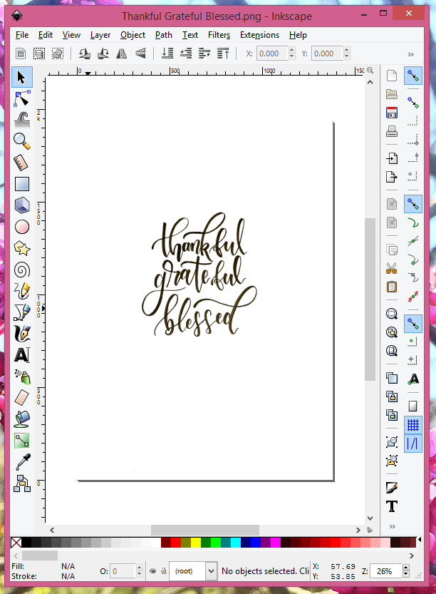
You will then want to navigate to Path->Trace Bitmap. You will see a pop up box with Mode, Options, and Credits tabs. We are only concerned with the Mode tab which is where we will be choosing our thresholds and other options that allow for the vector image to be produced. You will not want to make changes to the other tabs. Some of the best results I have seen come from using the brightness cutoff option with a threshold of 0.880 and 0.970. As well as making sure to only use 2 colors. By creating a black and white image and making the distinction as stark as possible in the previous steps using GIMP, the 2 colors option works really well to capture all of those beautiful curves on your art piece.
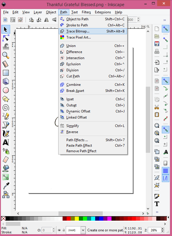

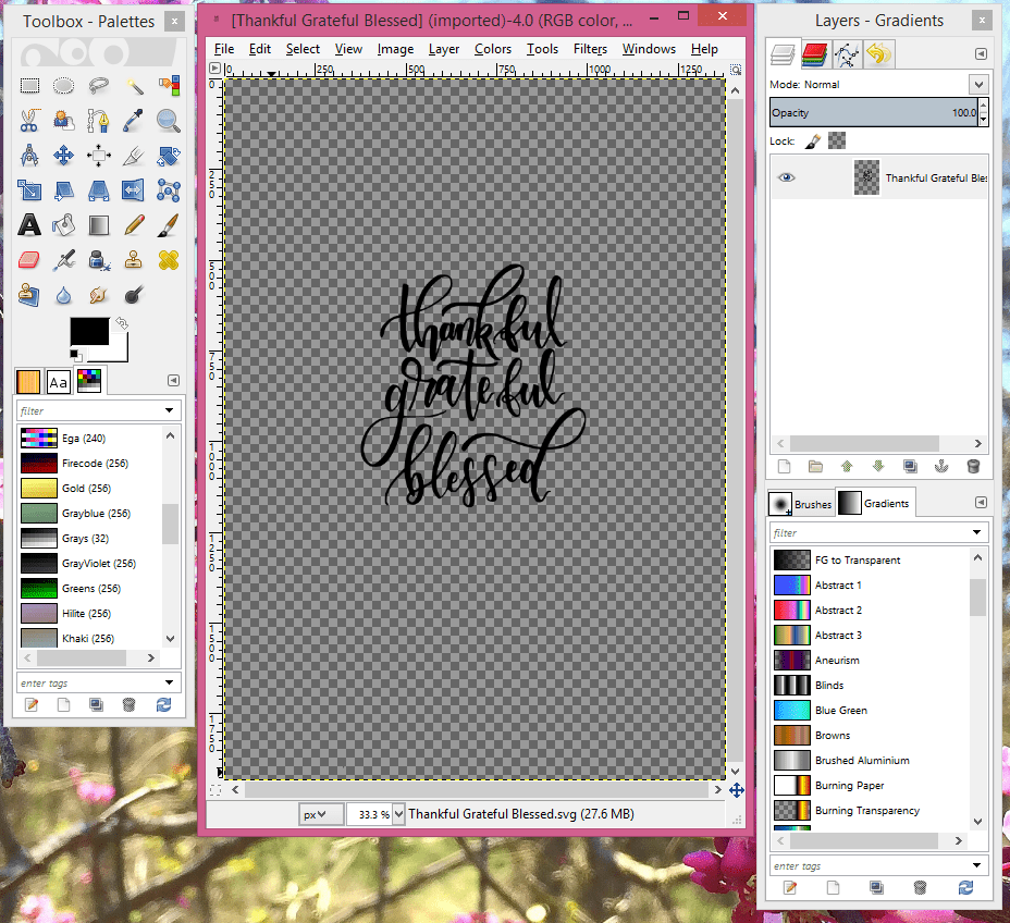
Inkscape creates a vector version of your black and white image over your original file. You will now want to move the vector over and delete the background image. The image below is the black and white original created with GIMP compared to the vector image created with Inkscape.

You should now have a clean vector version of your lettering. Save your vector image as an “.svg” and you are done with Inkscape!
Part 3: Layer It Up!
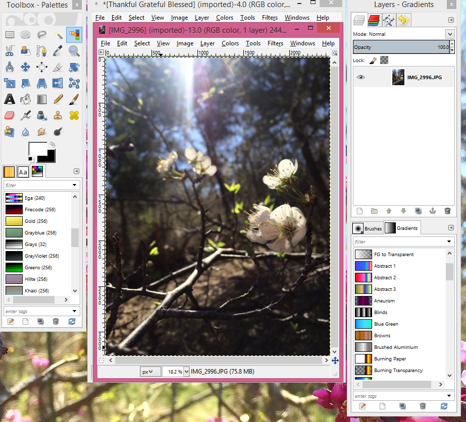
Switch back to GIMP and open your vector image.
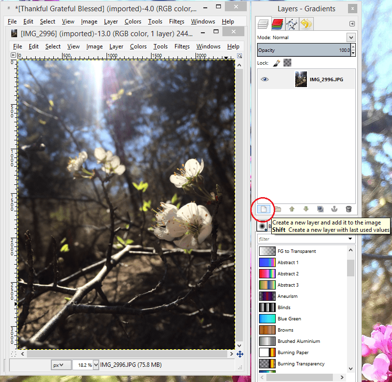
You will then open the image that you would like to add your lettering to. I used a photo taken at the family ranch at the beginning of spring. Check out those beautiful spring blooms!
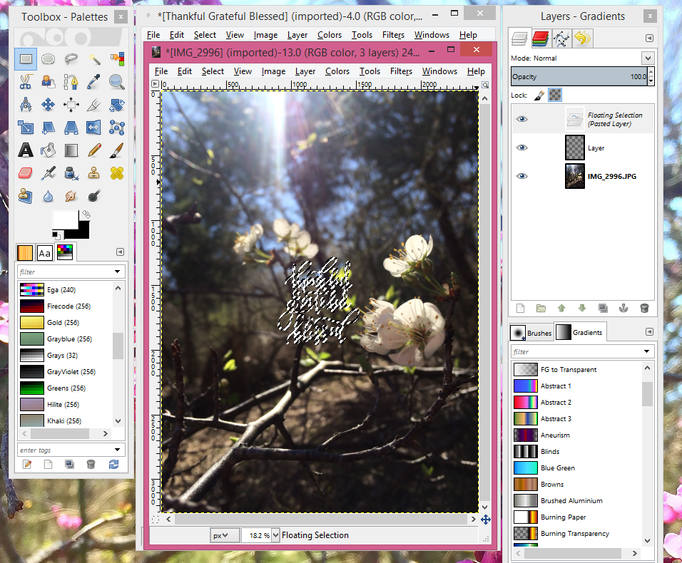
It’t time to get all layered up! You will now use the layering tools window to add a layer.
Now go back to your lettering and select the text by using the select by color tool. You can now use use the paint can in the Toolbox to change the color of the text to any color your heart desires!
I usually use white because it stands out, but I have made a few where I used some fun colors. As long as your letters are connected, using the fill tool (paint can) will fill each word. If you have breaks in your wording, like I do in the word “grateful”, then you will have to color each section.


Warning: Changing the color of your vector can be done multiple times. However, it will become grainy after the you change the color a second time. If you choose a color you do not like, then you should “undo” or (CTRL+Z) to get back to the original color and redo the steps to change to a new color. Ex: If you change your lettering from black to white then decide you want to change color again and, color select all the white to change to yellow, you will notice that the smooth lines of the vector image become grainy.
Use the square select tool at the top left of the Toolbox-Palette window to select your text and copy (CTRL+C). You will then paste (CTRL+V) in the new layer that you created.
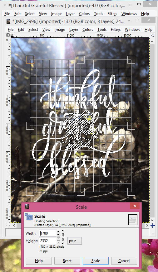
Use the scale tool to enlarge or reduce your text.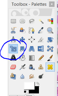

This could be your final piece….but let’s make it even better! I like to add a shadow effect to make the letters pop just a bit more. If you would like to learn how to add a shadow effect to your lettering then keep reading!
To add a shadow, you will go back to the black vector and change the color to something that will make the letters pop off your photo. For this, I just used a simple gray. You will add another layer to the picture and then repeat the steps to copy paste and scale. It is a good idea to keep track of what dimensions you scaled your main color to. Using the same width and height will allow you to easily create the shadow color the same size as your main color. You will want to place the shadow just slightly offset from the original color and arrange it to behind your primary color using the down arrow icon. The arrangement arrows can be found, between the layers tab and the brushes/gradients tab, in the Layers and Gradients window.

Remember to save your final by exporting the image to a “.png” file format!


Part 4: Post, Print, or Frame Your Masterpiece!
So….now you’re done! You have made a beautiful, unique piece for all sorts of projects or occasions using completely FREE tools. Go you!
Thank you SO much for visiting – hopefully, this blog helped you pick up a few photo editing tricks. I’d love to see your creations and answer any questions you might have! Post your creations and tag #designwithtxbelle and tag @galicia_cruz on Instagram. Be sure to check my blog for more updates and tips!
